Mego
Visual Identity Redevelopment
Refreshing the brand identity for a specialist recruitment company.
Client: Mego Employment Ltd
Sector: Recruitment Agency
Project Type: Visual identity, Graphic design
In Association With: Hedgerow Marketing
About Mego
Mego is a well-established recruitment company based in the South West of the UK, with offices in Bristol and Totnes. Specialising in the manufacturing and service sectors around airports, Mego places both temporary and permanent staff, many of whom transition from temporary to permanent roles. Known for their bespoke approach, Mego tailors its services to meet the unique needs of each client, offering agile solutions to the complex and ever-changing workforce demands of the industries they serve.
The Requirement
Mego’s existing brand identity had been in place for over a decade. The senior leadership team recognised that the evolving landscape of workforce and employment sectors required a fresh look—one that better reflected the company’s modern-day services, the changing needs of employers and job seekers, and the longstanding client relationships they pride themselves on.
During a series of initial brand workshops led by Lesley Anderson from Hedgerow Marketing, a key insight emerged: Mego's real differentiator lies in their ability to forge long-term, mutually beneficial relationships with clients. This unique strength needed to be captured in the new visual identity.
The Solution
From the outset, we engaged in collaborative discussions with Mego’s team to explore the best direction for the rebrand. The team was torn between evolving the existing visual identity and starting from scratch. After presenting several design concepts that addressed both options, we worked closely with Mego to refine the approach.

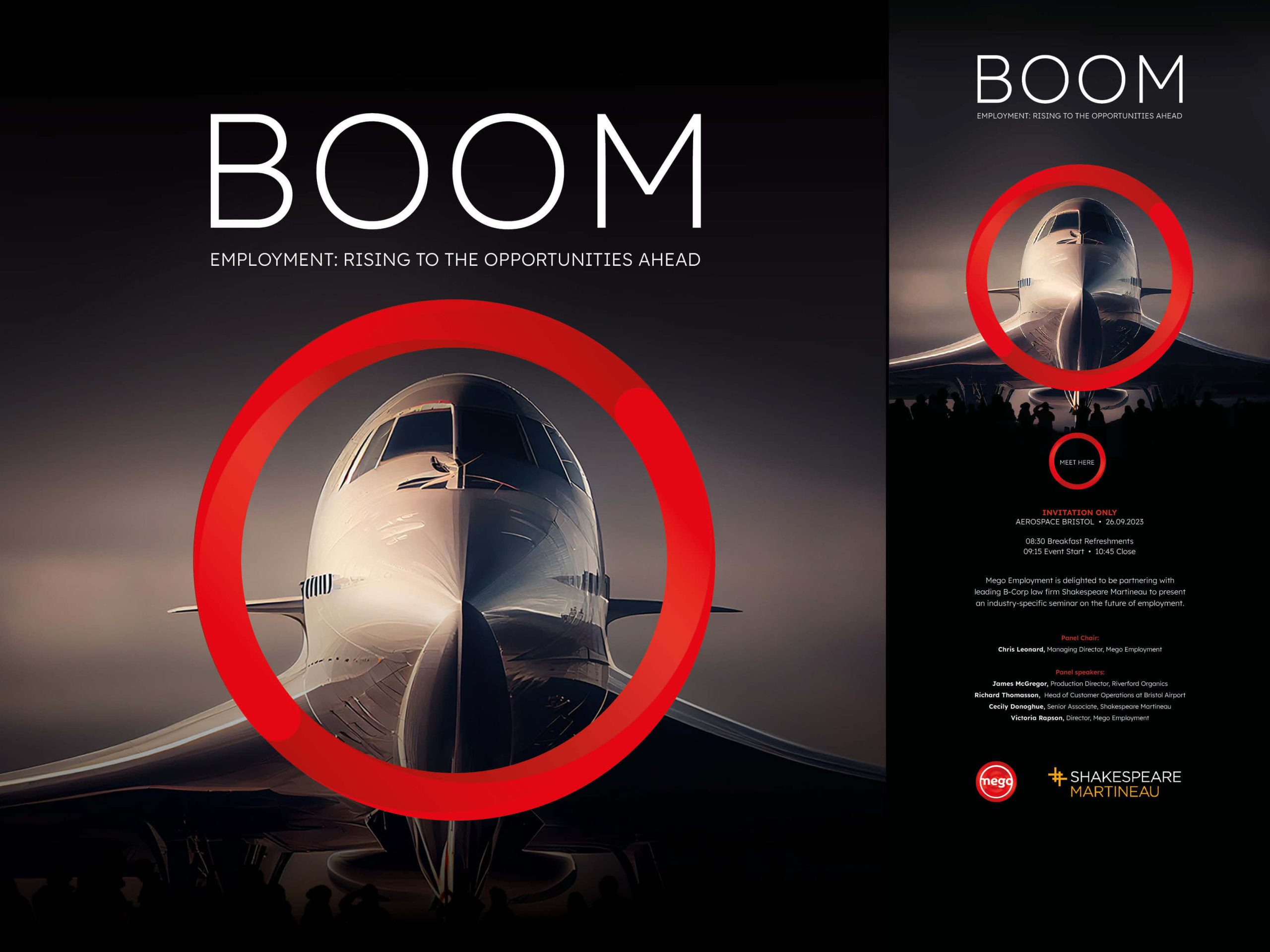
The solution we landed on was a nuanced evolution of the current logo—one that maintained the brand's established recognition while providing a more contemporary feel. The addition of the strapline "embedded recruiters" was key in communicating Mego’s deep integration into their clients’ businesses. To visually represent this, we introduced a concentric circle device, symbolising the strong, enduring relationships Mego builds with its clients, and their central role in the recruitment process.
This wasn’t a radical departure but a thoughtful update that better aligned the brand with the current market and Mego’s unique value proposition.
Application
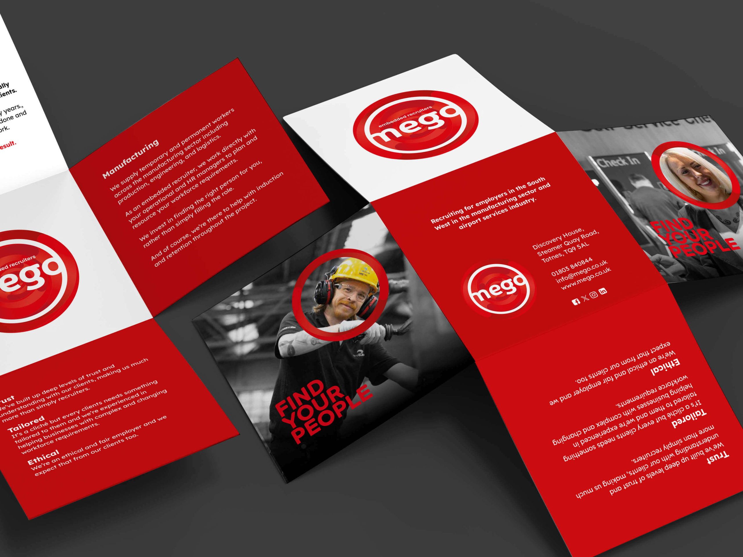
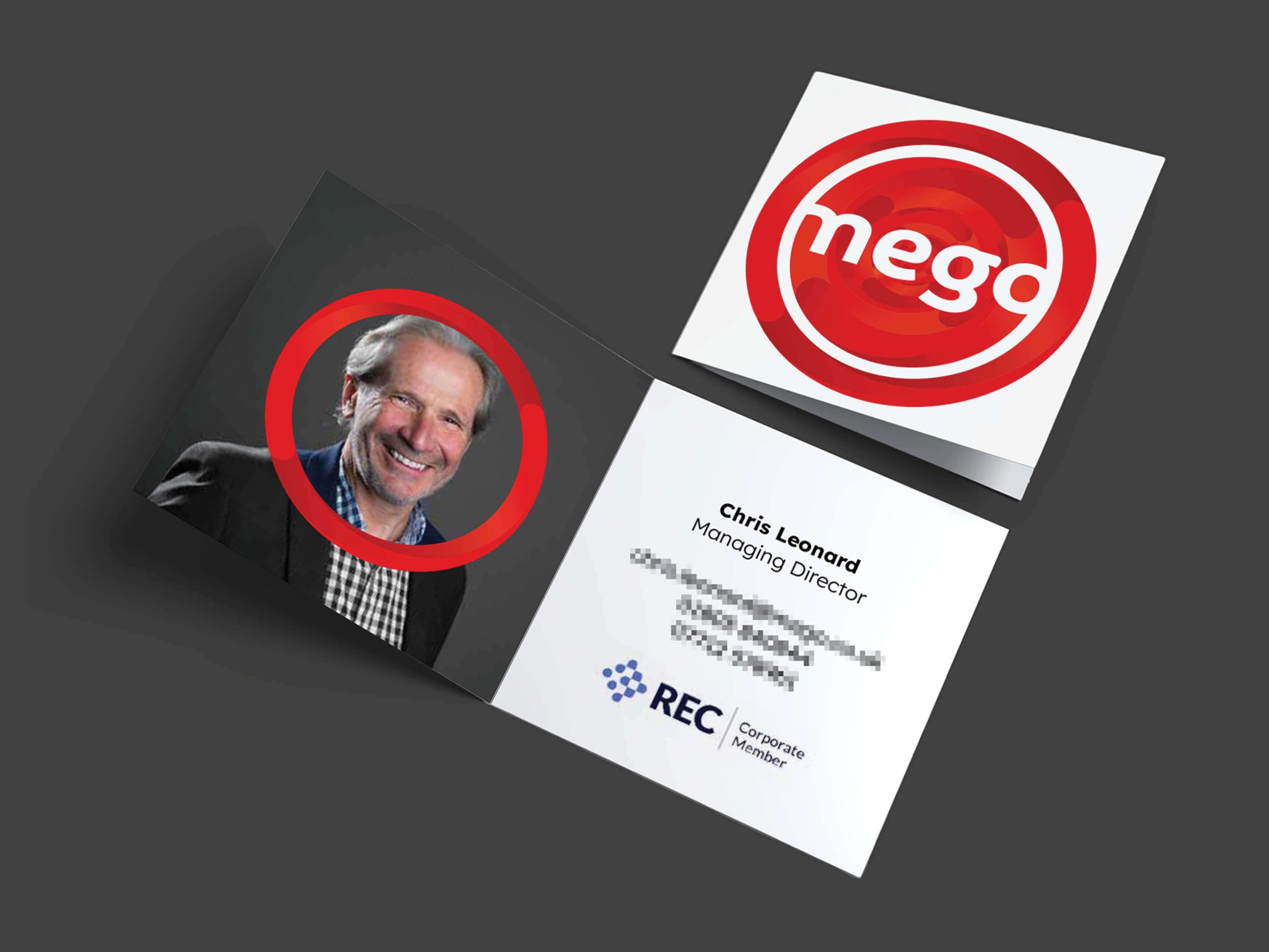
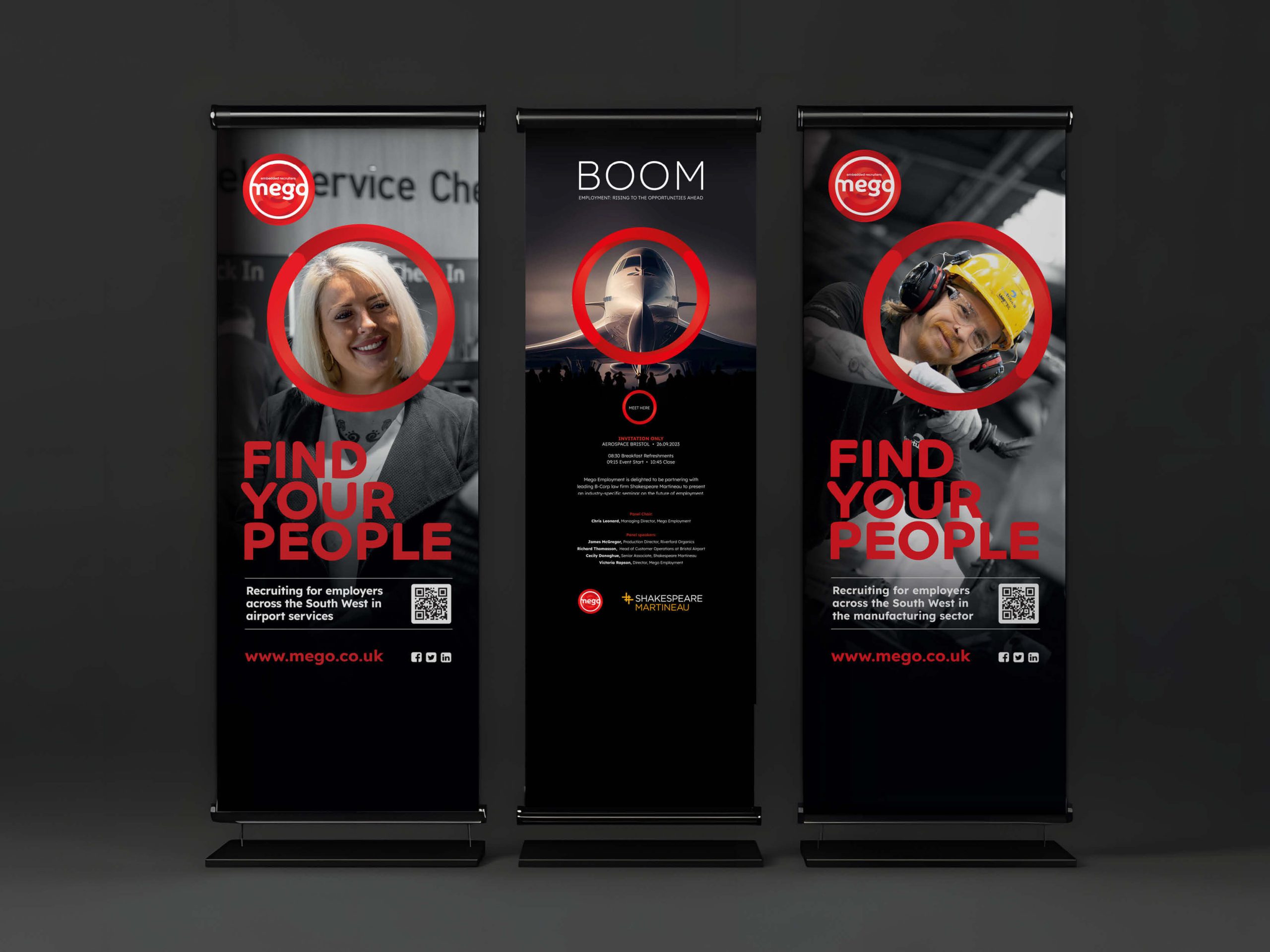
The refreshed identity was applied seamlessly across a variety of touchpoints to ensure consistency and maximum impact:
- Website – A fully redesigned, user-friendly site to reflect the updated brand and improve client experience.
- Exhibition Banners – Bold, attention-grabbing designs for events and trade shows.
- Company Stationery – Refined business cards, letterheads, and internal materials for a cohesive brand presence.
- Marketing & Promotional Materials – Brochures, flyers, and digital assets to support Mego’s ongoing marketing campaigns.