Burton Reid
Re-energising the brand identity for award winning ecological consultancy practice.
Client: Burton Reid Associates
Sector: Ecological Consultancy
Project type: Visual identity and graphic design
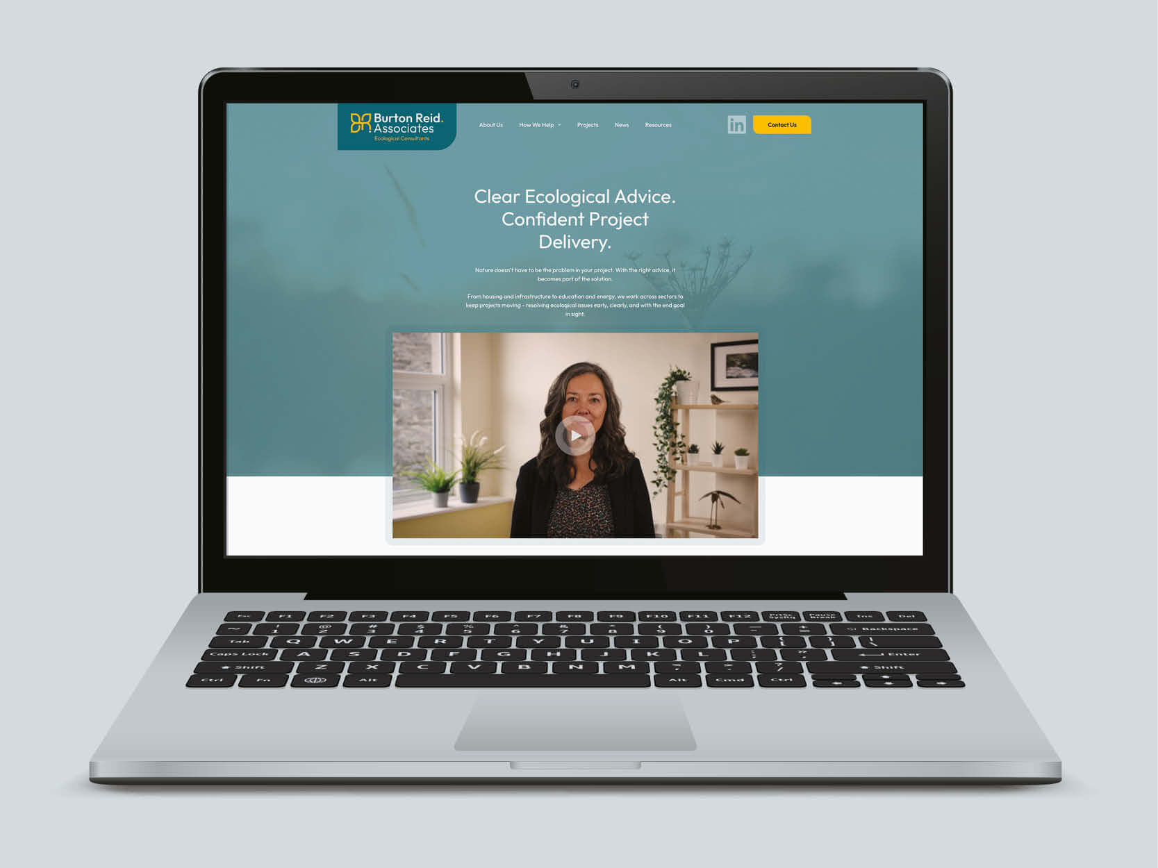
Website: Toco Digital
About Burton Reid
Burton Reid Associates is an award-winning ecological consultancy based in the South West, known for delivering high-quality ecological services with a strong values-led approach. Their reputation is built on practical expertise, close collaboration with clients, and a commitment to achieving the best outcomes for both people and nature. In recent years, the practice has twice received “Highly Commended” recognition in the CIEEM Small Consultancy of the Year Awards – a reflection of their dedication to excellence and innovation within the sector.
The Requirement
Burton Reid’s existing visual identity, while once fit for purpose, no longer aligned with the evolving direction and ambitions of the business. During initial consultation sessions with founder Jenni Reid, we worked together to distil the key attributes the refreshed identity needed to reflect.
These included:
- A natural, approachable, and optimistic tone
- A sense of innovation and dynamism
- A clear emphasis on their role as a trusted partner to clients
These themes became the foundation for our creative approach.
The Solution
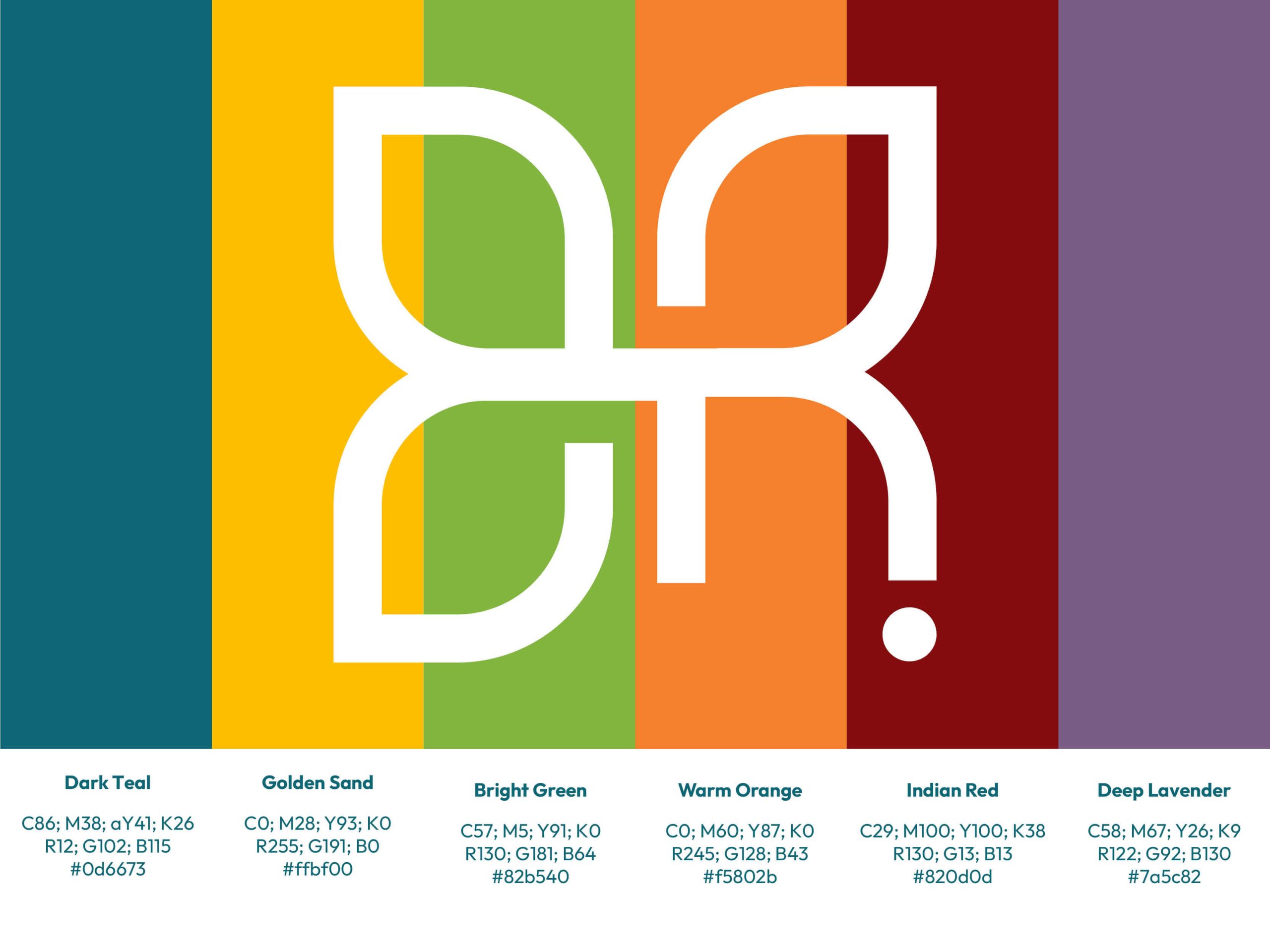
The Burton Reid team had already begun to explore ideas around colour and tone, which provided a valuable starting point. Building on this, we developed a series of initial concepts, each offering a slightly different interpretation of the brief.
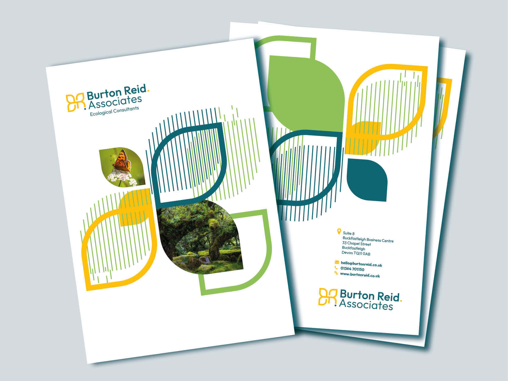
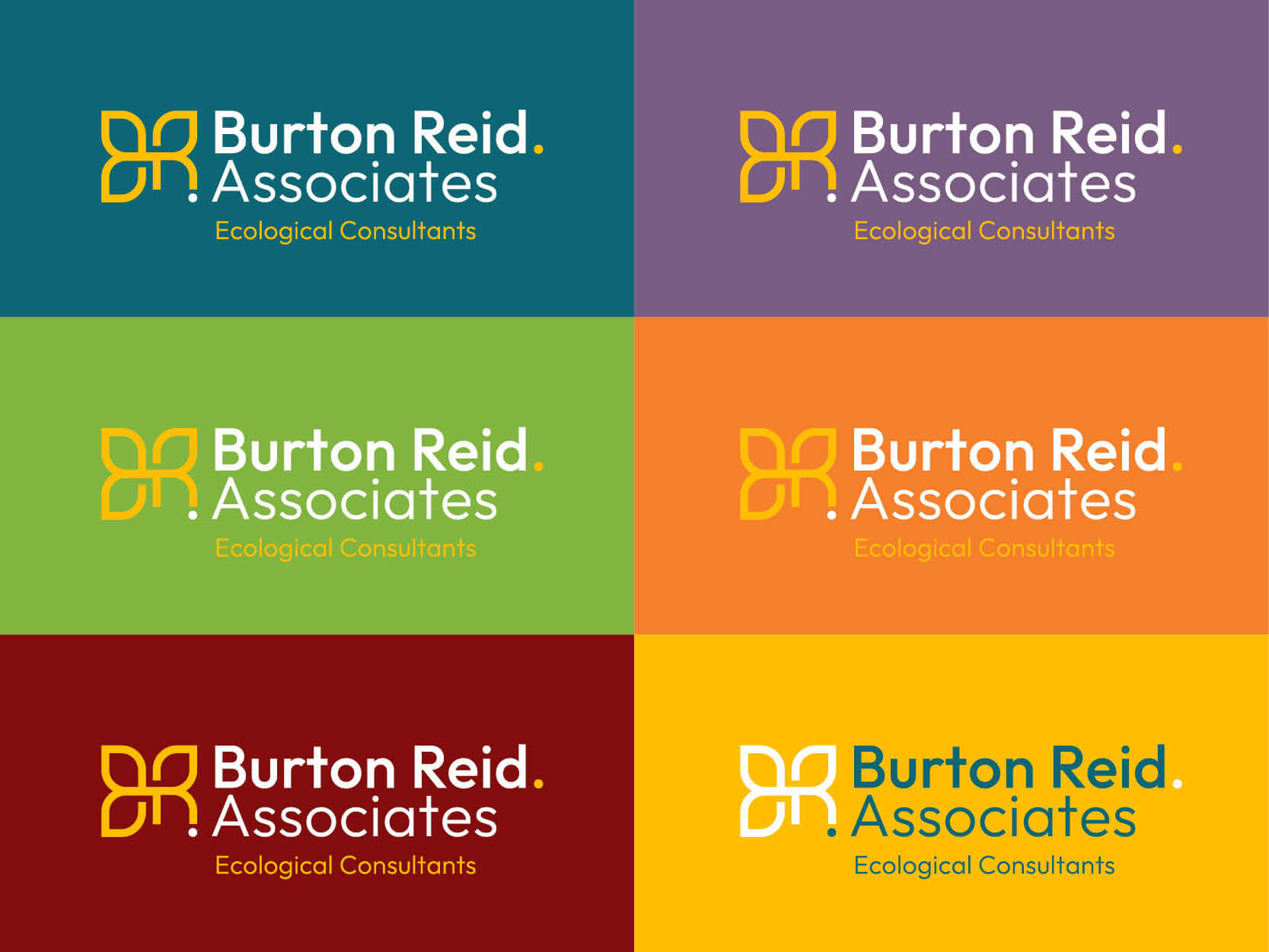
Feedback sessions with Jenni and her team were collaborative and insightful. From the outset, one design stood out: a clean, modern monogram of the initials ‘B’ & ‘R’. This concept balanced contemporary design with subtle organic references — echoing natural leaf shapes and butterfly wings — to create a distinctive, professional, and optimistic mark.
The final identity successfully captured the spirit of the practice while presenting a cohesive and credible image across all platforms.
Application
The new identity has been rolled out across a range of materials, both printed and digital, including:
- Ecological report covers
- Exhibition banners
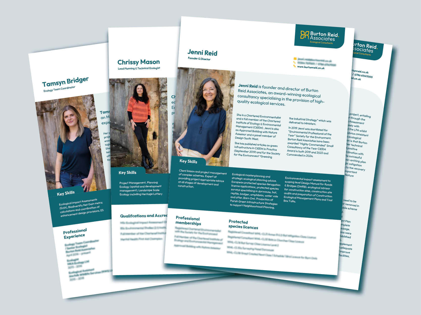
- Team CVs
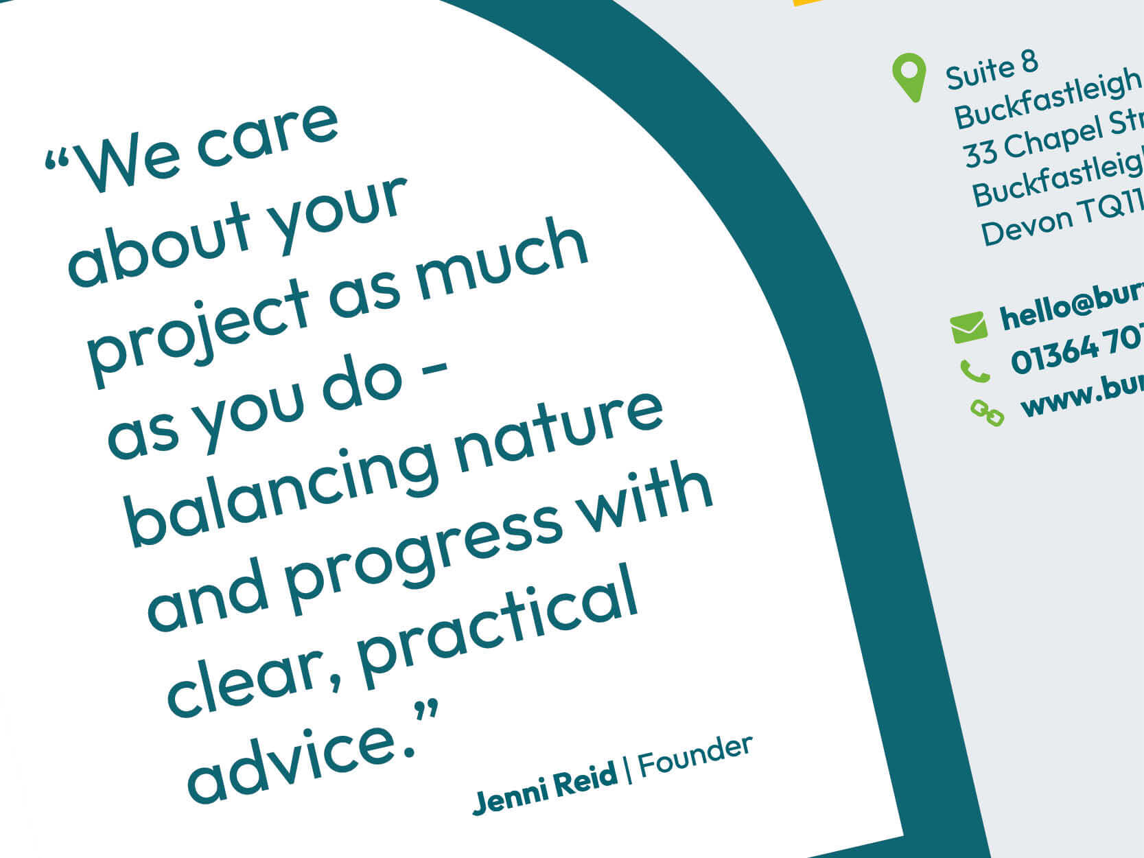
- Email footers
To support this new visual direction, a fully redesigned website was also developed by our sister company, Toco Digital, ensuring consistency in both messaging and user experience.
